Can-am Taranaki, Rebrand
About This Project
Taranaki Motorcycles has evolved over the years and having acquired the Can-am dealership for Taranaki meant that their current name did not align well with their product portfolio. So Can-am Taranaki was conceived.
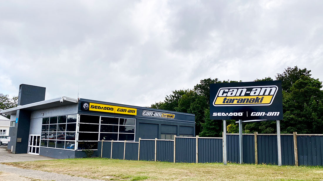
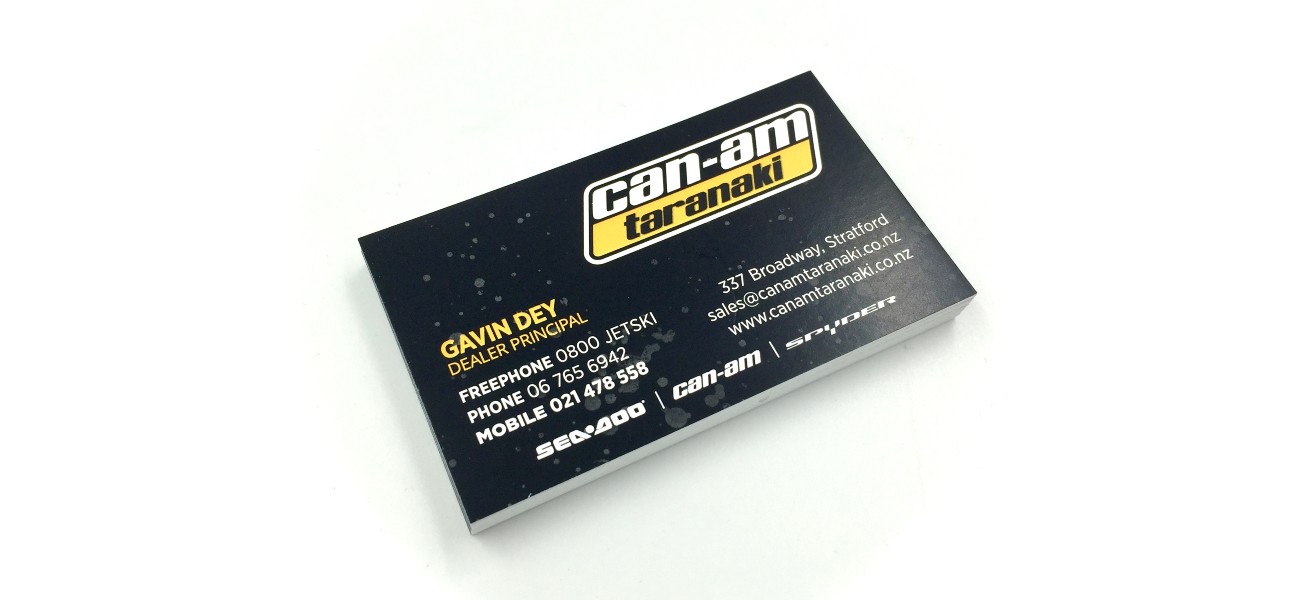
Gavin wanted the logo to be contained in a shape, something that could easily be made into a decal and something that used the Taranaki amber and black colour scheme. We had to make the budget spread across logo, business cards, building and road front signs, fleet signage and a stack of decals to apply to the vehicles he was selling.
To maximise the budget and help with brand recognition, we suggested seeking permission from Can-am BRP to use the can-am wordmark. That gave us a starting point for his brand that his potential customers would instantly recognise, and minimise the time needed to develop the logo. We manually created the word Taranaki to match the can-am wordmark and made it all fit in a tidy container to meet the brief.
The full project included:
- Logo Design
- Business Cards
- Road front sign panels (to fit existing frame)
- Shopfront sign, and installation of supplied Seadoo / Can-am lightbox
- Vehicle signage
- Vinyl Decals
The new brand is a clear reflection of Can-am Taranaki’s product portfolio and local roots.
Custom Field
Lorem ipsum dolor sit amet
Date
20 November